
Primary Logo - light background
Download logo
“FINTESO” blends Finance, Technology, and Solutions, signaling our role as a modern partner for business growth within the EU.
The FINTESO brand identity reflects our commitment to clarity, professionalism, and forward-thinking solutions. Rooted in Estonia’s digital-first, zero-corporate-tax environment, FINTESO Corporate Solutions stands at the intersection of finance, strategy, and innovation.
This chapter defines the core elements that shape how our brand looks, feels, and communicates—from our mission and name to the logo and values that drive us. These foundational elements ensure consistency and recognition across all touchpoints, helping clients, partners, and stakeholders instantly connect with who we are and what we stand for.
FINTESO provides integrated, end-to-end corporate services—from business formation to financial strategy and legal support—tailored to entrepreneurs and enterprises expanding across borders. Based in Estonia, we combine digital innovation, tax efficiency, and trusted expertise to simplify complex processes and empower businesses to grow with confidence.

A visual symbol of clarity, structure, and strategic growth.
The FINTESO logo is more than a mark—it’s a visual expression of our brand’s personality and mission.
Logo Meaning & Symbolism
Below the wordmark sits the tagline “Corporate Solutions” in smaller capital letters, grounding the logo in its business context and communicating our area of expertise.
The FINTESO icon is a standalone representation of the brand: a stylized “F” built with stacked, dynamic bars that evoke momentum, hierarchy, and a strategic roadmap. It serves as a compact, powerful visual that represents the brand when full wordmarks are not suitable.
Where to use the icon:
To maintain visual clarity and prevent crowding, always surround the FINTESO logo and icon with adequate clear space.
Clear Space Rule:
The minimum clear space around the logo should be equal to the height of the “F” symbol in the icon. This space must be free of text, images, or other graphic elements.
Padding in Layouts:

FINTESO isn’t just another business services provider. We stand at the intersection of strategic insight, legal and financial precision, and the forward-thinking advantages of Estonia’s digital economy. Our distinct value lies in our comprehensive approach, global outlook, and commitment to solving complex challenges—efficiently and confidentially.
Estonia Advantage
Operate from the most digitally advanced EU country with 0% corporate tax, full e-residency access, and seamless integration into European markets.
End-to-End Corporate Services
From company formation to financial forecasting, legal support, and business expansion—FINTESO delivers everything under one roof, with a single point of accountability.
Expertise in Complex & Non-Standard Cases
We specialize in solving sensitive or unconventional business and private matters that require strategic thinking, confidentiality, and hands-on execution.
Strategic Growth Focus
We go beyond compliance—helping you find investors, clients, and partners, develop market-entry plans, and unlock funding opportunities through EU and government programs.
FINTESO’s colors are professional, bold, and modern—reinforcing stability and trust while introducing subtle warmth through accent tones.
Finteso Blue
Primary color
The core brand color. Professional, stable, and trustworthy. Use this for headers, key brand accents, navigation bars, and CTAs.
Finteso Cyan Blue
Primary Red-Orange
A vibrant, modern accent inspired by digital efficiency. Brings lightness and energy to charts, buttons, and UI highlights.
Finteso Soft Blue
Background Color
A subtle, elegant background color. Provides visual air and calm while keeping layouts aligned with brand tones.
Slate Gray
Secondary Color
A strong neutral tone used for legibility, structure, and professionalism. This is your go-to for interface text and outlines.
Finteso Deep Blue (#1A4D8F) is the primary brand color — ideal for headlines, buttons, logos, and high-contrast visuals. Avoid using it on dark backgrounds or near clashing tones like red or orange.
Finteso Cyan Blue (#45C6F0) acts as a vibrant accent for links, hover states, charts, and UI highlights. Use it sparingly to maintain its impact and avoid applying it to large text blocks.
Finteso Soft Blue (#F5FAFF) serves as a calm background for sections, forms, and branded documents. It shouldn’t be used for text or strong overlays without contrast testing.
Slate Gray (#222831) supports your neutral design needs — best for body text, outlines, and structural elements. It’s not intended as a dominant color or full-page fill.
Across all uses, prioritize accessibility, maintain visual hierarchy (Deep Blue = priority, Cyan = action, Gray = structure), and keep designs clean by limiting simultaneous color use.
Typeface: Montserrat
Style: Geometric sans-serif
FINTESO uses the Montserrat font family to reflect its values of professionalism, modernity, and clarity. Originally inspired by signage in the historic Montserrat neighborhood of Buenos Aires, the typeface offers a geometric, tech-savvy, and structured look — ideal for a brand rooted in digital infrastructure and business intelligence.
| Element | Font Size | Weight | Line Height | Use Case |
|---|---|---|---|---|
| H1 | 40–48px | Bold | 120% | Main Heading (H1) |
| H2 | 32px | Bold | 120% | Section titles, banners |
| H3 | 26px | Bold | 120% | Subsections, feature highlights |
| H4 | 22px | Bold | 125% | Smaller headings, cards |
| H5 | 20px | Bold | 130% | Labels, subtitles |
| H6 | 18px | SemiBold | 130% | Minor headings, callouts |
| P | 18px | Regular | 150% | Paragraph text, descriptions |
FINTESO’s colors are professional, bold, and modern—reinforcing stability and trust while introducing subtle warmth through accent tones.
FINTESO’s imagery should reflect clarity, professionalism, strategic thinking, and trust. Use clean, minimal visuals that evoke digital innovation, European excellence, and business intelligence.
Visual Guidelines:


FINTESO uses minimal stroke-based icons to convey clarity, precision, and a digital-forward identity. Icons are a key element in helping users quickly understand services, navigation, and features.
Primary Style Rules
Consistency in layout and spacing reinforces a clean, professional image—core to FINTESO’s brand. White space, alignment, and proportion contribute to user trust and readability.
Grid System
FINTESO uses a 12-column responsive grid for web and digital layouts, with flexible gutters and margins. This ensures scalable and structured design across screen sizes.
Padding & Margins
Use generous spacing to emphasize content clarity and brand sophistication.
FINTESO’s tone should reflect its role as a strategic, trusted corporate advisor. We speak to experienced professionals, entrepreneurs, and executives from different cultural and economic backgrounds.
“Our language should feel like a conversation with an expert consultant — confident, helpful, and straight to the point.”

We help clients feel confident, informed, and understood in every interaction.
Every interaction with clients, partners, or institutions reflects the FINTESO brand. That’s why clear, confident, and strategic messaging is essential across all communication channels. These guidelines define how we speak and write — ensuring consistency, professionalism, and alignment with our core values. Whether we’re creating web content, investor documents, legal communications, or emails, our voice must reflect FINTESO’s credibility, precision, and client-first approach.
Client-Centric Framing
Focus on outcomes for the client, not the process. Use “you” and “your” more than “we” and “our.” Example: “You gain a strategic presence in the EU with our help,” instead of “We provide EU entry support.”
Strategic Clarity
Simplify technical details without oversimplifying meaning. Break down concepts like tax planning, digital registration, and mergers in layman’s terms—unless writing for specialists.
Credibility Through Consistency
Speak from experience. Use phrases like “with over 20 years of experience…” or “backed by results across the EU…” Be consistent in how services and terms are presented across channels.
Purpose-Driven Luxury
Prioritize clarity and structure over decorative language.
Use bullets, numbered steps, and headings to guide the reader.
| Instead of | Use |
|---|---|
| “We help with company stuff.” | “We oversee every aspect of your company setup in Estonia.” |
| “We do your numbers for you.” | “Our CFO services give you the data to make faster, smarter decisions.” |
| “We deal with the complicated bureaucracy.” | “We simplify regulatory navigation, so you can focus on business.” |
| “We help you grow and find people.” | “We connect you with investors and partners across the EU.” |
These practical tips will help all team members and partners stay on-brand when writing or speaking on behalf of FINTESO:
Do
1. Speak directly to the client: Use “you” and “your” to center the reader.
2. Use precise, confident language: Avoid fluff. Stick to facts and benefits.
3. Highlight strategic outcomes: Show clients how your services improve their business.
4. Stay consistent in terminology: Use standard terms like “company formation,” “financial forecasting,” “legal support,” etc., to maintain clarity across platforms.
5. Use active voice whenever possible: It’s more direct and professional.
Don’t
1. Avoid vague or exaggerated claims:
2. Don’t use overly technical terms with general audiences:
3. Don’t mix tones within the same message:
4. Avoid informal slang, emojis, or internet shorthand:
FINTESO’s website must deliver a clean, professional, and strategically structured user experience. It should reflect our efficiency and depth of service through a layout that’s intuitive, trustworthy, and conversion-optimized. The visual style must reinforce clarity and stability — never cluttered or aggressive.
Simple navigation
Clear top-level menu with intuitive paths. All pages should be reachable in 3 clicks or less.
Service Blocks
Use structured layouts: headings, short descriptions, and bullet-point benefits for easy reading.
Mobile-First Design
Fully responsive with mobile-optimized buttons, forms, and layouts.
On-Brand Visuals
Use Montserrat font, brand colors, and stroke-style icons for consistency.
Multilingual Ready
Support English, Estonian, and Russian. Toggle must be clearly visible.
SEO-Friendly Structure
Clean URLs, proper headings (H1–H3), metadata, and optimized media.
Search Engine Optimization (SEO) and Answer Engine Optimization (AEO) are critical for ensuring that FINTESO is discoverable by both traditional search engines (Google) and AI-powered assistants (ChatGPT, Siri, Gemini). Every service page, blog, and document must be structured with semantic clarity and algorithm-ready metadata.
Key Principles
Use H1–H3 tags properly
H1 for the main page title, H2 for sections, H3 for sub-points
Include Keywords Naturally
Incorporate phrases like “Estonia company formation”, “EU startup support”, or “corporate finance in Estonia” organically within text.
Clear CTAs in Each Service Section
Guide visitors with direct language. Example:
Leverage Structured Metadata & Schema Markup
Implement proper schema types like: Organization for company data, LocalBusiness for address/contact info, Service for offerings. This improves AI summarization and search previews.
Descriptive Alt Text for All Images
Every image must include keyword-rich descriptions. Example: ❌ “image1.jpg” → ✅ “Entrepreneur registering EU company online via FINTESO portal”
Clear CTAs in Each Service Section
Guide visitors with direct language. Example: “Start your company in Estonia today” and “Book a free consultation with our finance experts”
| Use |
|---|
| ✅ “FINTESO helps foreign entrepreneurs open EU-based companies with legal and tax support.” |
| ✅ “Access Estonia’s zero corporate tax advantage with our CFO-level financial services.” |
| ✅ “Our multilingual experts assist in company formation, licensing, and cross-border expansion.” |
FINTESO Corporate Solutions is a trusted partner in corporate setup, financial strategy, and business expansion across the EU. With a focus on Estonia’s unmatched tax advantages and digital infrastructure, FINTESO delivers reliable, high-level support for businesses at every stage.
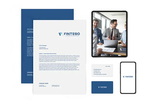
This section outlines how the FINTESO brand appears across physical and digital touchpoints to ensure professional consistency in all client interactions.

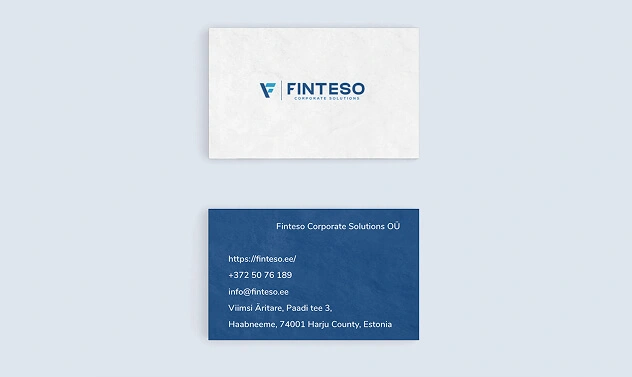
Business Cards
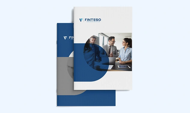
Brochures & Flyers
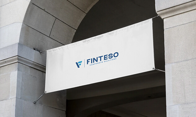
Banners & Signage

Uniforms & Accessories
All written communication should maintain the FINTESO tone—professional, clear, and informative. Use consistent formatting in internal and external documents.
Email Signatures
Email signatures are an essential part of FINTESO’s brand presence in daily communication. A professional, unified email signature reinforces credibility and maintains consistency across all departments and team members.
Design Notes
Document Formatting Rules
Internal and client-facing documents—such as business plans, presentations, financial reports, and contracts—must follow a unified style that reflects FINTESO’s professional, trustworthy image.
Video Content
FINTESO’s video strategy aims to present complex services in a simplified, digestible, and visually engaging way, helping clients quickly understand key offerings and benefits.
Recommended Video Types:

Ad Creatives
To generate awareness, leads, and trust by highlighting concrete benefits and differentiators of FINTESO’s services, especially for international startups and companies.
Ad Formats to Prioritize:
Visual Elements:
Advertising & Media – Sponsorships & Partnerships
FINTESO engages in sponsorships and strategic partnerships that align with its mission of supporting entrepreneurs, startups, and business development across Europe and beyond. These collaborations help increase visibility, build trust, and reinforce its position as a reliable gateway to EU business opportunities.
Social Media
Strategy
Social media is not just for visibility — it’s a trust-building and lead-generating platform. FINTESO uses social media to demonstrate knowledge, highlight success stories, and maintain engagement with both current and future clients.
Informative, Not Promotional
Share valuable content—industry updates, business strategies, and market insights—instead of hard-sell advertising.
Consistent Brand Voice
Maintain a professional, concise, and solution-oriented tone across all platforms. Avoid casual or overly complex language.
Simplified Visual Content
Use infographics, diagrams, and short explainers to communicate complex services in an accessible and engaging way.
Client-Focused Messaging
Highlight real-world outcomes, benefits, and solutions for clients—avoid listing services without context.
Branded Visuals
Incorporate FINTESO’s color palette, typography, and stroke-style icons in all graphics to maintain visual consistency.
Multilingual Posting
Reflect the international audience with content in English, Estonian, and Russian when appropriate, especially for core updates and service highlights.
Primary Channels
YouTube
Best for explainer videos, expert interviews, and simple visual walkthroughs of services. Content Focus: short 1–2 min explainers of services, testimonials, animated business scenarios.
LinkedIn
The most important platform for FINTESO. Ideal for reaching business owners, professionals, and investors. Content Focus: business insights & regulatory updates, case studies & strategic advice.
Facebook
Useful for wider visibility and engaging both local and international clients. Content Focus: service highlights, event updates or success stories, light educational content in multiple languages